I ended up in a situation where I needed to use a light theme for work due to bright surroundings. My favorite themes didn’t cut it. The contrast was repeatedly insufficient.
As a result, I created the BlueberryPeach color theme with good contrast in dark and light mode so that I can switch modes based on my surroundings. You can find a list of ports in the project’s README. Also, this blog’s light and dark themes are BlueberryPeach’s!
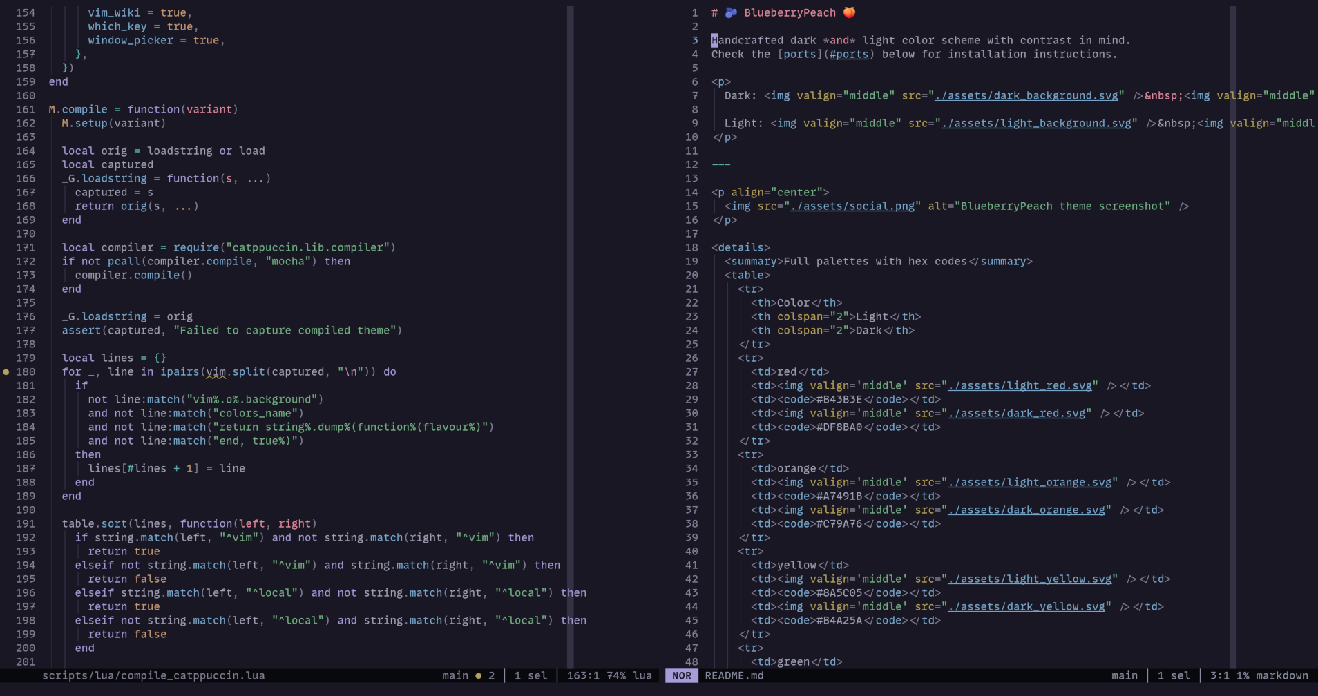
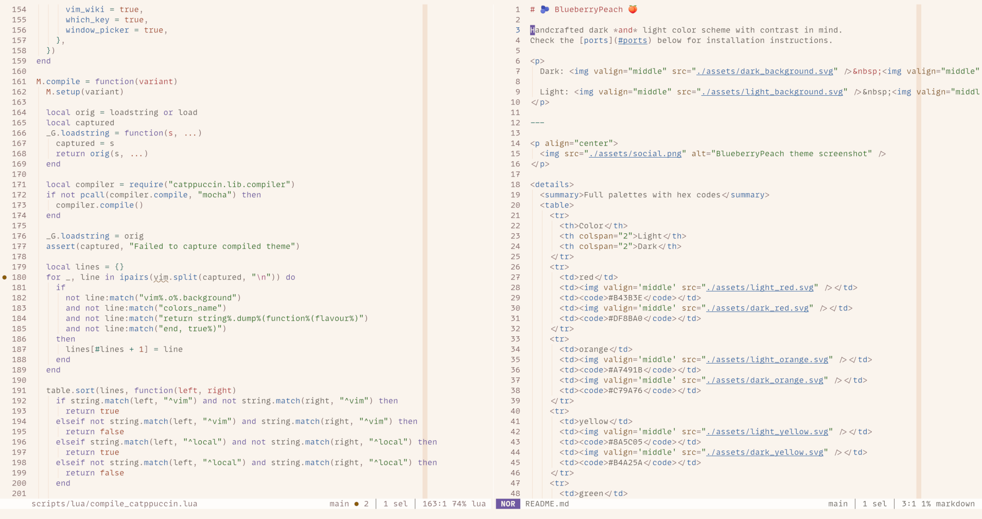
Goals for BlueberryPeach’s light and dark mode:
- Sufficient contrast
- Uniform contrast
- Sufficient color difference
Contrast
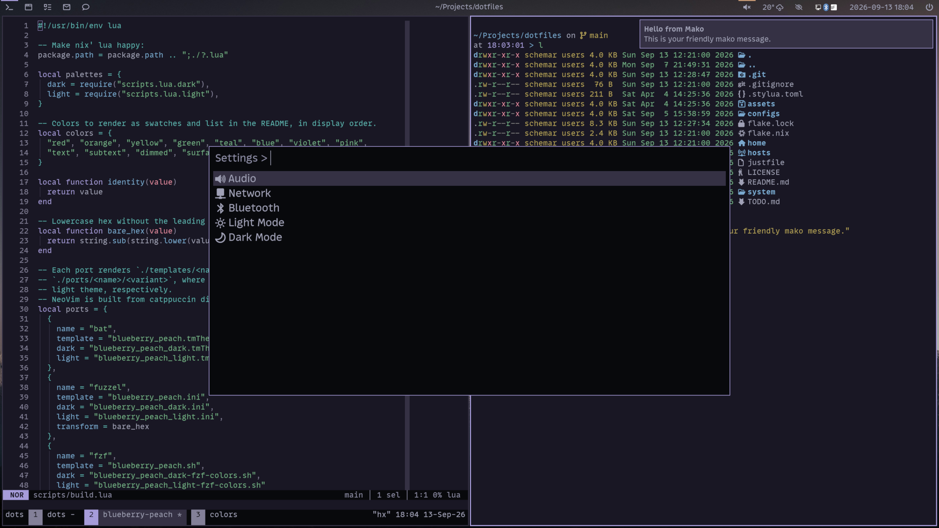
BlueberryPeach Dark in sway
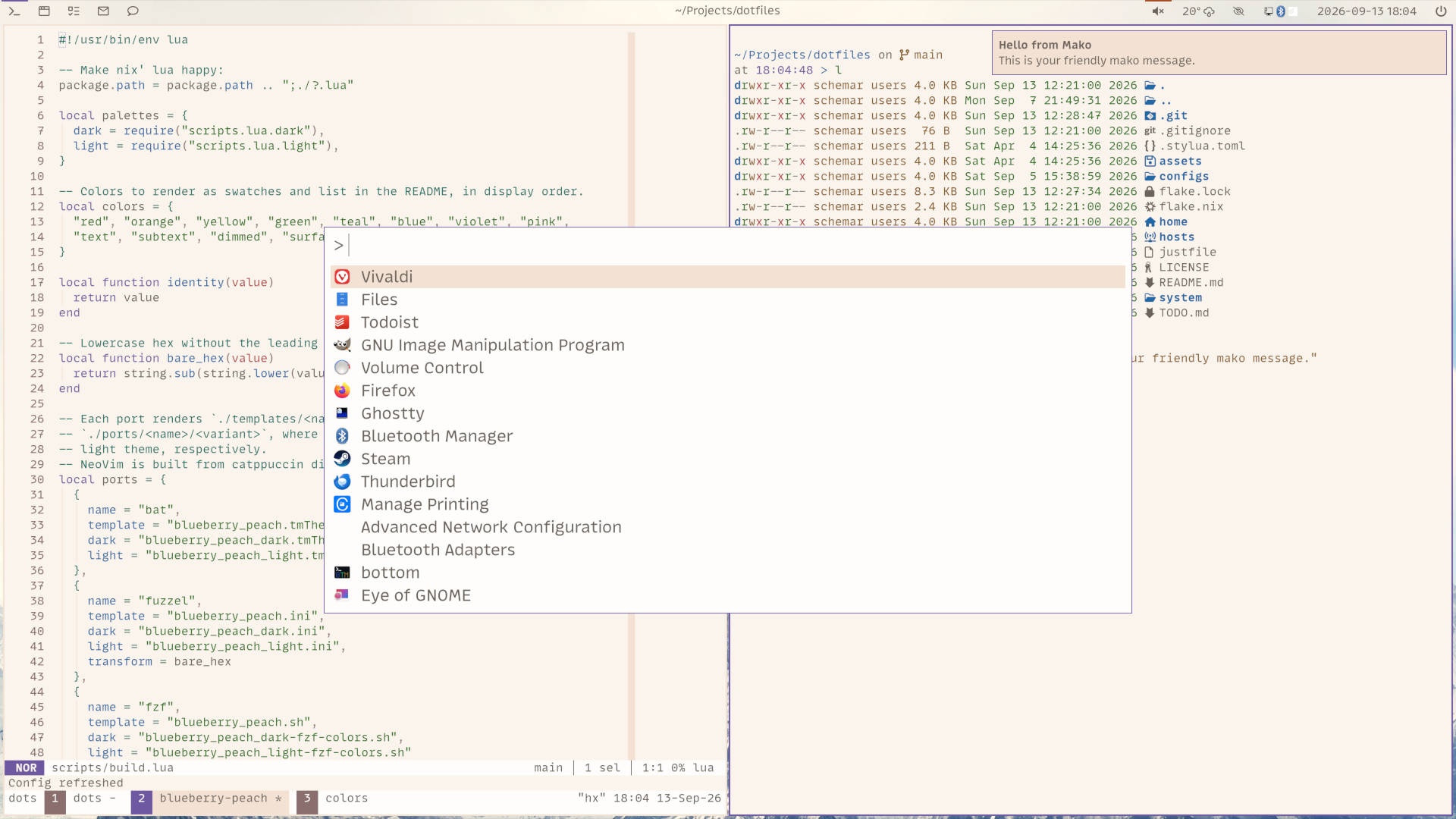
BlueberryPeach Light in sway
BlueberryPeach has good contrast, except for dimmed text. The minimum
contrast of
colors, text, and subtext on the default background is 4.6:1 in light mode and
5.45:1 in dark mode. The contrast of dimmed text on the default background is
4.2:1 in light mode and 4.6:1 in dark mode. Contrast of dimmed text on
an accented background is even lower, but shouldn’t be used in practice. The
contrast is not ideal, but I did not find a better way to represent dimmed text.
I wanted to achieve a notable difference to the standard text, but not add too
much color. After all, dimmed text should still be perceived as text.
Also, in BlueberryPeach the contrast across the main colors (and text) is consistent. This means they all have almost the same contrast with the background. In my opinion, different contrast makes sense when you want to emphasize certain colors, for example red for danger, but not when you highlight source code. There is a table of contrasts in BlueberryPeach’s GitHub README.md.
The result is a theme that’s both legible and pleasant to the eyes. The contrast is good, but doesn’t hurt even after prolonged sessions.
Compromises
Consistent contrast comes with drawbacks. For example, it’s harder to differentiate some colors like red/orange/yellow in light mode. So their hue needs to be spread a bit to maximize their difference. Among other things, this led to a red color that looks slightly pinkish. This required a lot of trial and error where I tried different hues to move colors apart.
A minimum contrast of 4.5:1 also led to compromises in light mode, where
colors need to be relatively dark due to the not-super-bright background. This
makes it harder to get a high perceived color difference between all the colors
and I had to spread them for that reason as well.
Influence
BlueberryPeach is heavily influenced by and uses sources from Catppuccin. I have used and enjoyed its dark mode for more than a year. I enjoy its approach of a “soothing pastel theme”1. I like not only the palette of Catppuccin Mocha, but I also enjoy their careful integration with many, many plugins in Catppuccin’s Neovim port. BlueberryPeach’s Neovim port is based on the one from Catppuccin.
Rosé Pine is also a strong influence. I love Rosé Pine’s palette selection. They nailed their stated goal of “something beautiful”2. It looks and feels so good that I had to pick their light and dark background colors for BlueberryPeach.
In the long-gone past, I used Solarized extensively, which surely has influenced me as well. The goal was to have dark and light modes as opposites of each other and cohesive3. Solarized kind of introduced me to the topic in the first place. I even created a Solarized version of the Arc theme many years ago (unmaintained by now).
Comparison
Due to different design goals, the contrast of Catppuccin’s, Rosé Pine’s, and Solarized’s light modes is not as high or balanced as BlueberryPeach’s. In the following table, you can see the contrast for the highest and lowest contrast color in their palette. I specifically selected from the colors which are used in Neovim source code highlighting.
| Theme | Color | Contrast with Background |
|---|---|---|
| Solarized Light | Cyan | 2.92:1 |
| Solarized Light | Red | 4.28:1 |
| Catppuccin Latte | Lavender | 2.81:1 |
| Catppuccin Latte | Red | 4.80:1 |
| Rosé Pine Dawn | Gold | 2.05:1 |
| Rosé Pine Dawn | Pine | 5.59:1 |
| BlueberryPeach Light | Red | 5.28:1 |
| BlueberryPeach Light | Violet | 5.35:1 |
That’s why these light themes did not work for me. In addition to these main colors, BlueberryPeach does not use dimmed text for comments. Instead, it uses teal for comments specifically, as I consider comments a valuable part of any source code.
Try it!
BlueberryPeach has been my daily driver since May 2025. I released version 1.0.0 on 2nd September 2026. And it’s easy to get started! Look for ports in the README. Each port has separate installation instructions.
If you are missing a port or want to fix something, your contribution would make me happy :) Look at CONTRIBUTING.md. I put extensive documentation into the file on how to add a new port, update an existing port, or update the palette.